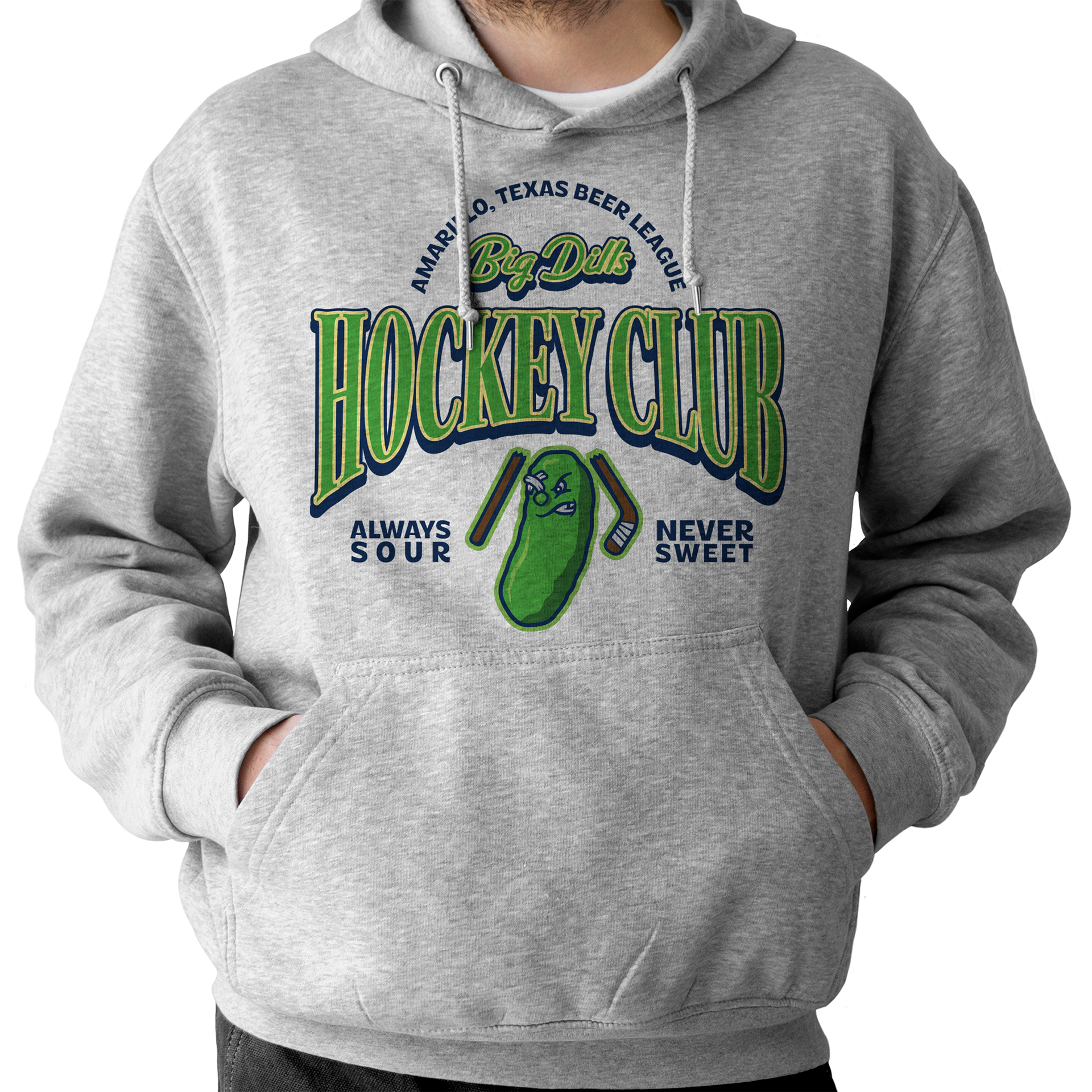
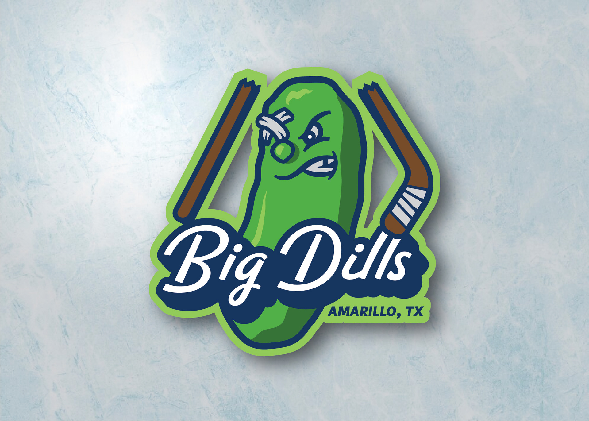
Primary Logo
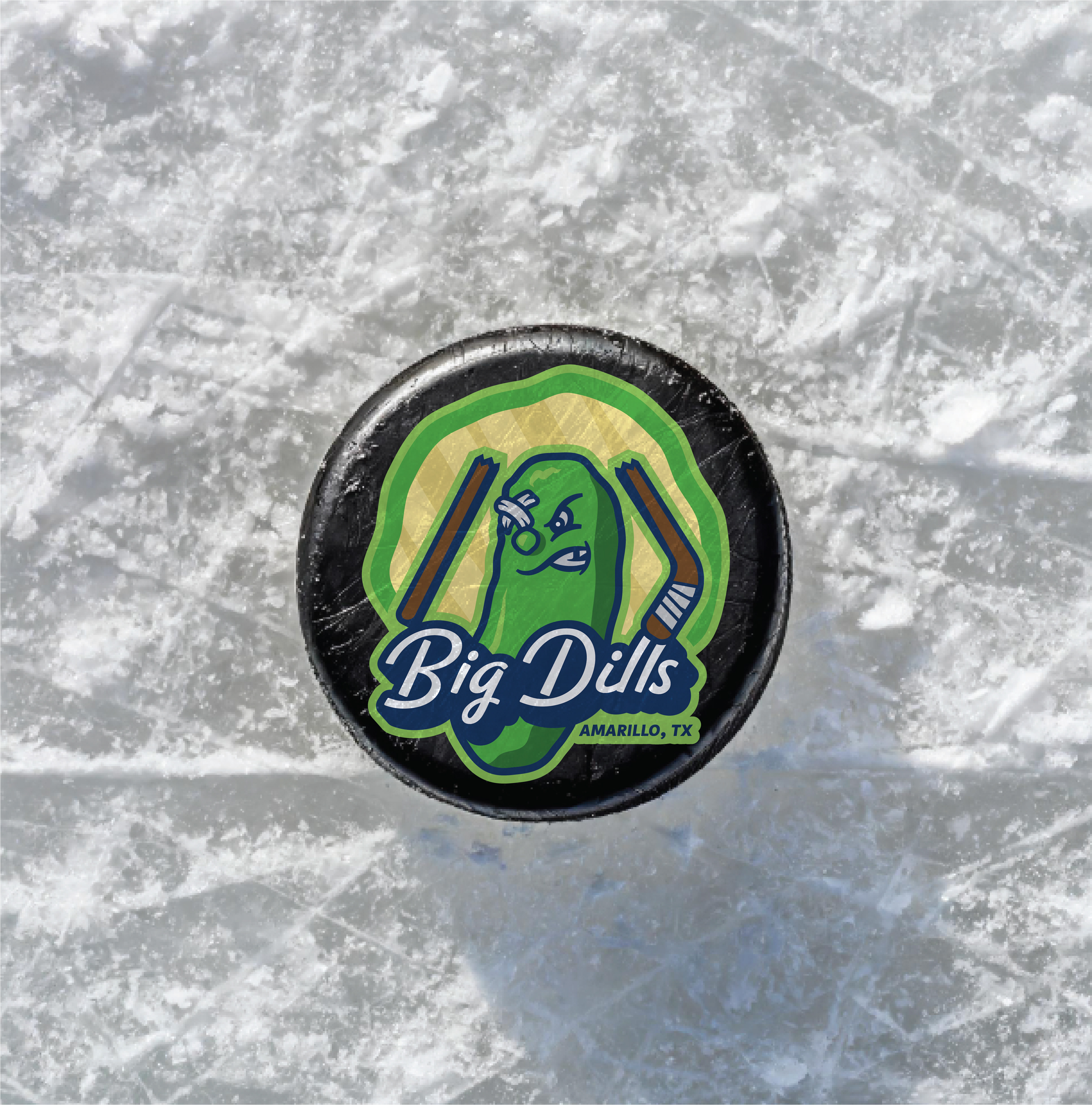
The Big Dills’ primary logo features the team mascot front and center. The sour (never sweet) dill pickle wears his various injuries and imperfections with pride as he busts a hockey stick over his head. The mascot style and overall vibe calls to minor league baseball logomarks, which are objectively the coolest logo style. The typography, however, takes a more retro turn away from standard sports type treatment in order to set the Big Dills apart from their league-mates.
"Pickle Chip" Badge Logo Variation
Instead of a standard badge or encapsulated logo variation (curving text over a plain background, a.k.a. boring), the Big Dills secondary logo is the same as their primary logo... except its set on a pickle chip! The "Pickle Chip" logo variation plays into the teams personality while maintaining their signature look.

Big Dills Hockey Puck