Graphic Design / Cooper Black Typeface Research Brochure
This project consists of a bifold brochure about the history and features of the Cooper Black typeface. The inside of the brochure includes notable elements of Cooper Black's anatomy, as well as a write up about its history and relevance. Because the typeface is so heavy, I wanted to use colors that were bright and airy to lighten the composition.
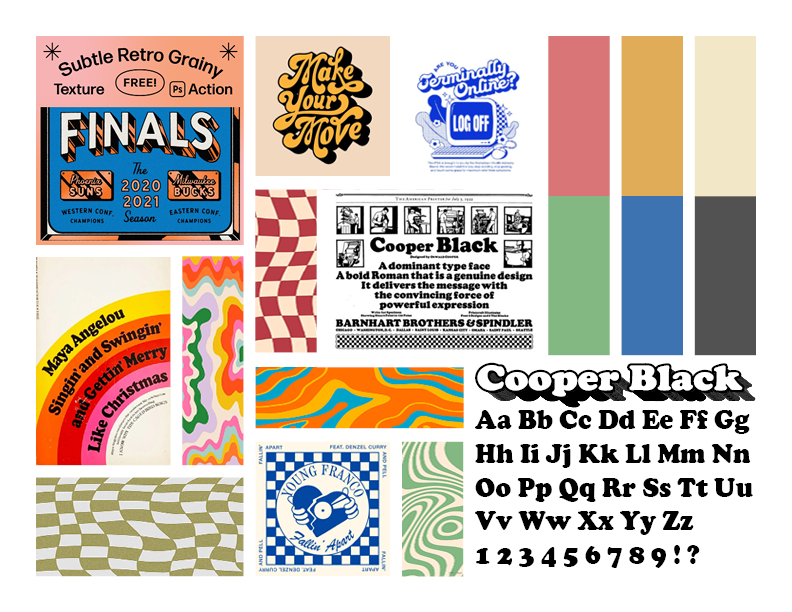
My choice for the checkerboard pattern came from an ad I found for the typeface released by its foundry in 1922, which I included in my project moodboard. The pull quote "the convincing force of powerful expression" also came from that same ad. I included both of these elements to reference the long history of the typeface and highlight its timeless nature. The back cover features Cooper Black's iconic ampersand, as well as "far" and "near", in reference to a quote by the typeface's designer Oswald Cooper. The quote in full, albeit unaffectionate, reads "its for far-sighted printers with near-sighted customers".


Concept sketches & moodboard
