
Graphic Design / Houston Star Riders

Project Overview
The goal of the project is to create an identity and collateral for a conceptual women’s baseball team with a strong focus on the cultural importance of women in sports. Deliverables for this project include a logo with variations, jersey and hat designs, a poster with the team's schedule and a score card, and a brand identity sheet.
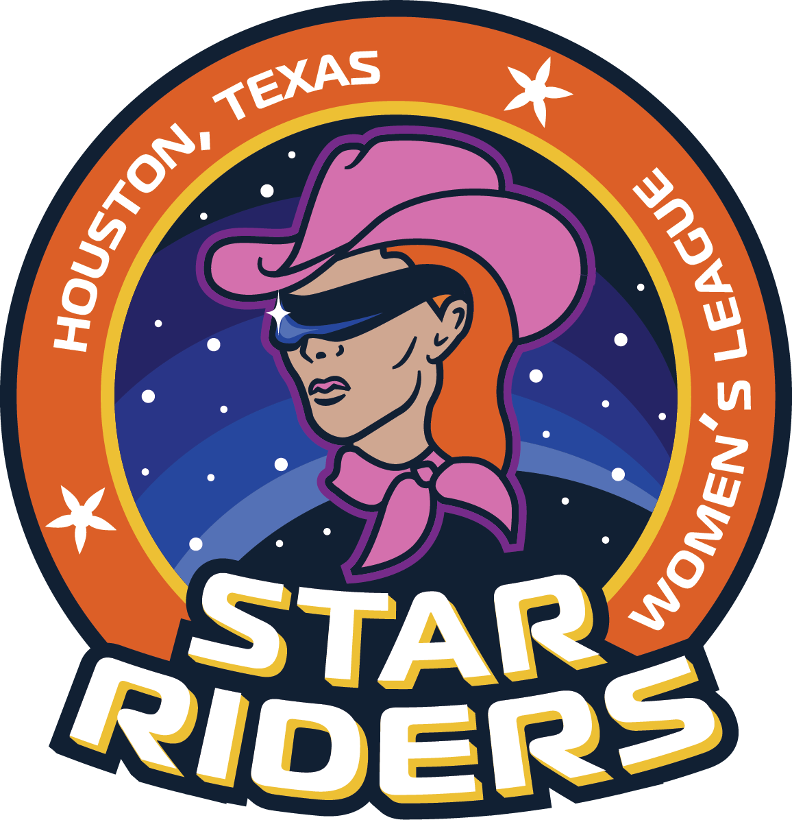
Star Riders Primary Logo
Star Riders - Name Breakdown
Star
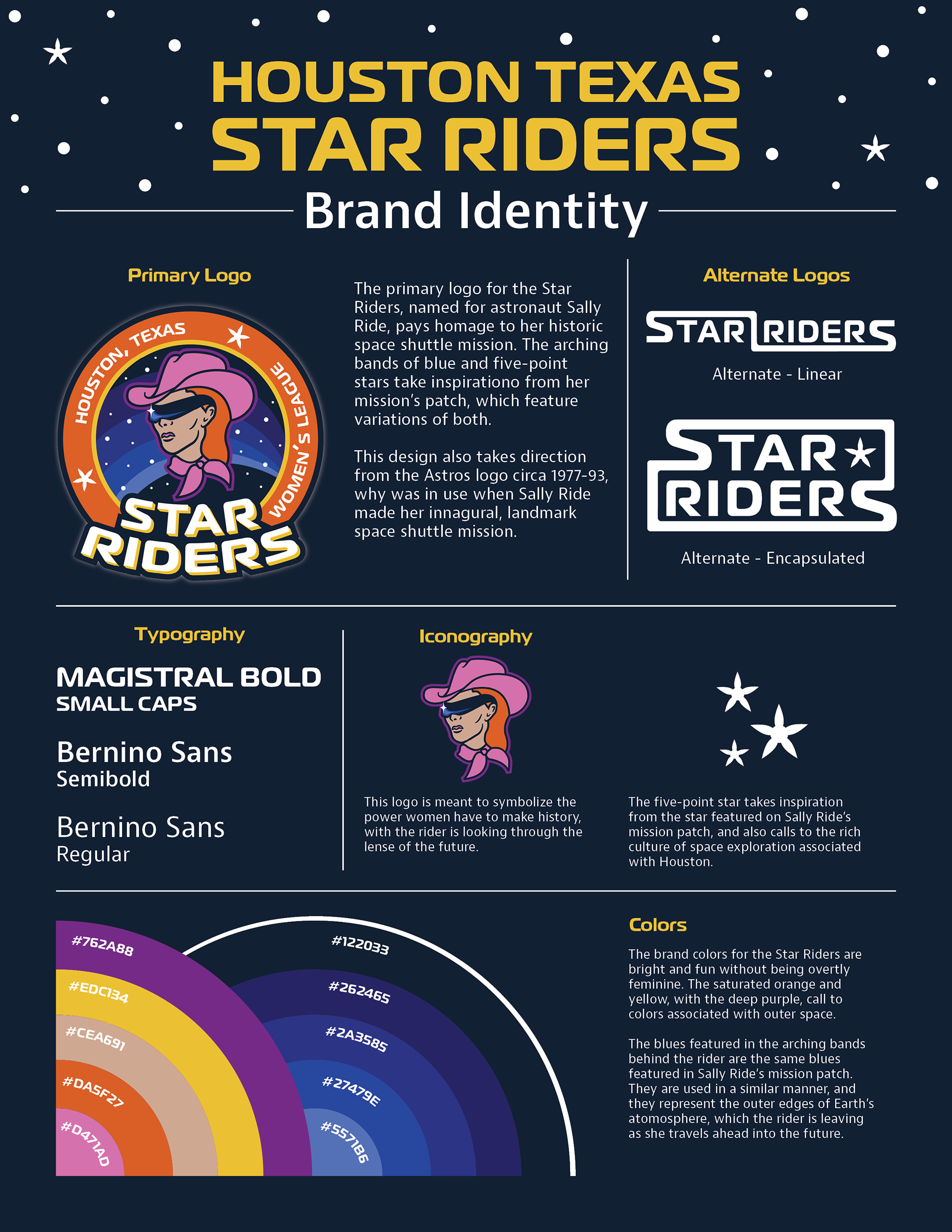
Star is representative of the team’s home city - Houston. Houston is well known to be a center of space research and exploration since it is home to NASA’s Space Center Houston. The two other notable baseball teams that call Houston home, the Houston Astros and the Sugarland Space Cowboys, both share space themes in their names. Thus, it is only fitting that this team should too.
Star is representative of the team’s home city - Houston. Houston is well known to be a center of space research and exploration since it is home to NASA’s Space Center Houston. The two other notable baseball teams that call Houston home, the Houston Astros and the Sugarland Space Cowboys, both share space themes in their names. Thus, it is only fitting that this team should too.
Riders
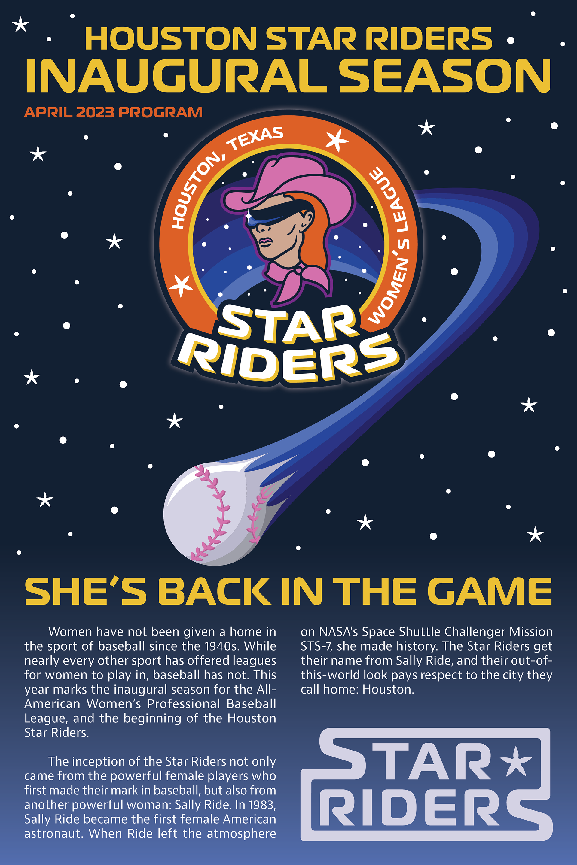
Rider has a double meaning. On one hand, it can represent the western cowboy culture that thrives in Houston and the state of Texas. On the other hand, and more meaningfully, it is a nod to the first American female astronaut, Sally Ride. On June 18, 1983 Sally Ride flew in the Space Shuttle Challenger on NASA’s STS-7 mission.
Rider has a double meaning. On one hand, it can represent the western cowboy culture that thrives in Houston and the state of Texas. On the other hand, and more meaningfully, it is a nod to the first American female astronaut, Sally Ride. On June 18, 1983 Sally Ride flew in the Space Shuttle Challenger on NASA’s STS-7 mission.
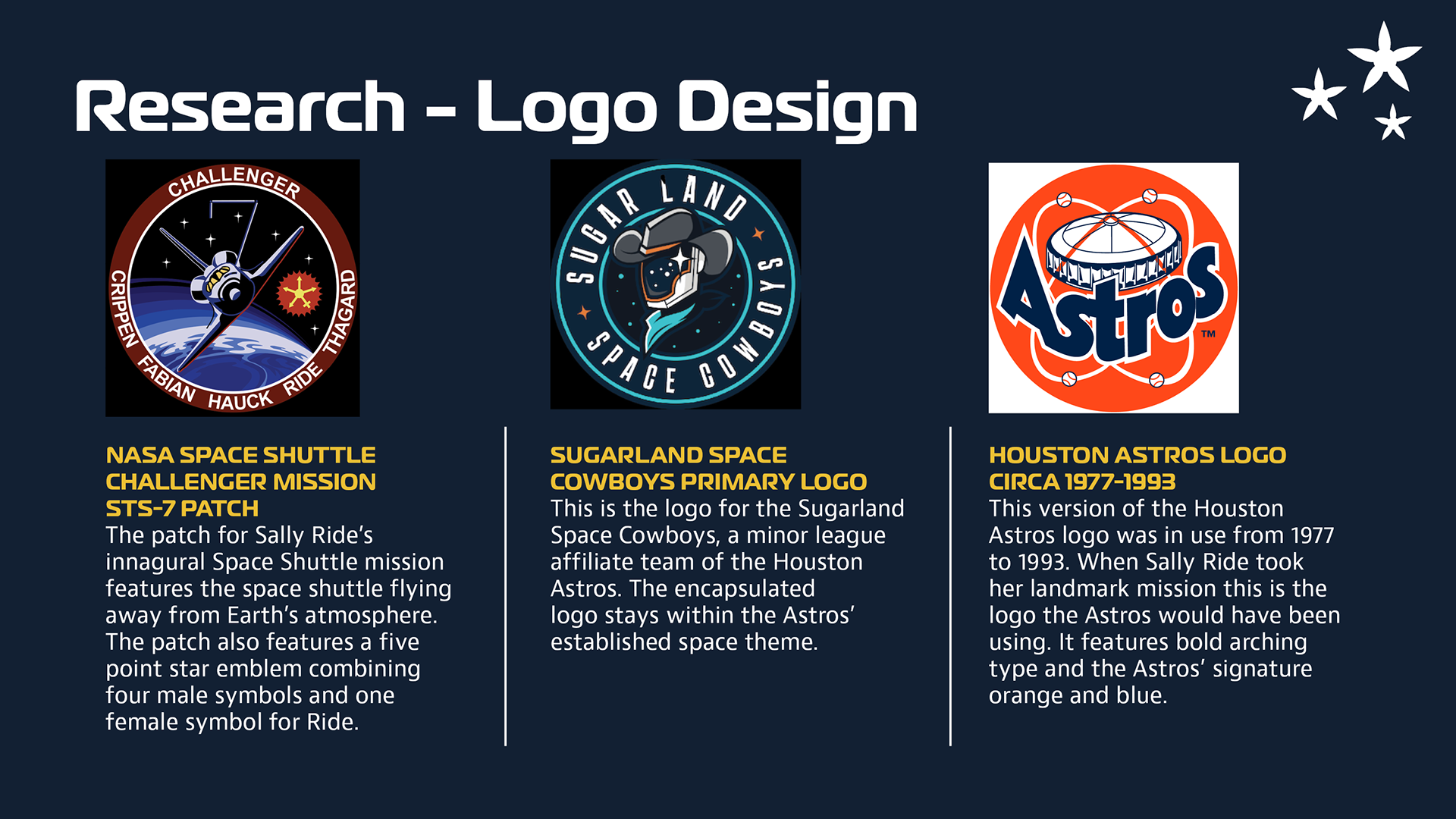
Research - Main Logo Design
Main Logo Design Breakdown
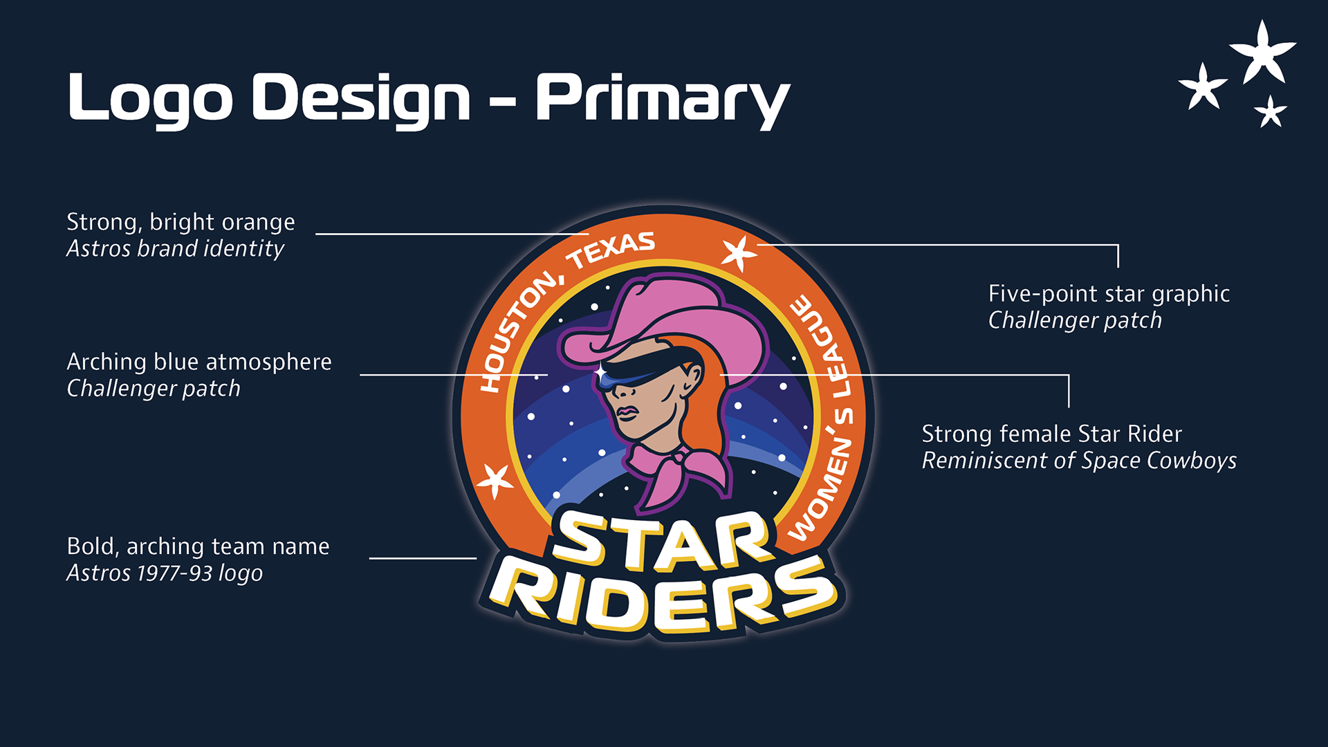
Primary Logo - Research & Design Breakdown
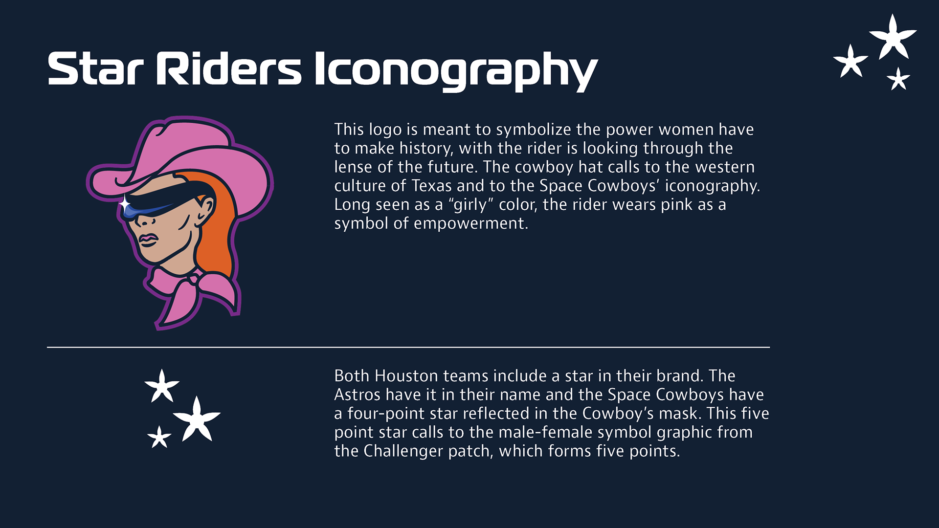
Iconography Breakdown
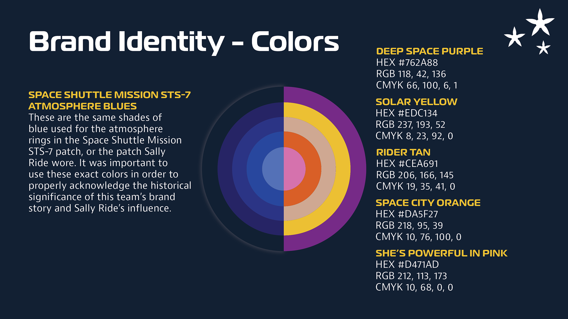
Colors Explanation and Breakdown
Iconography & Colors Breakdown
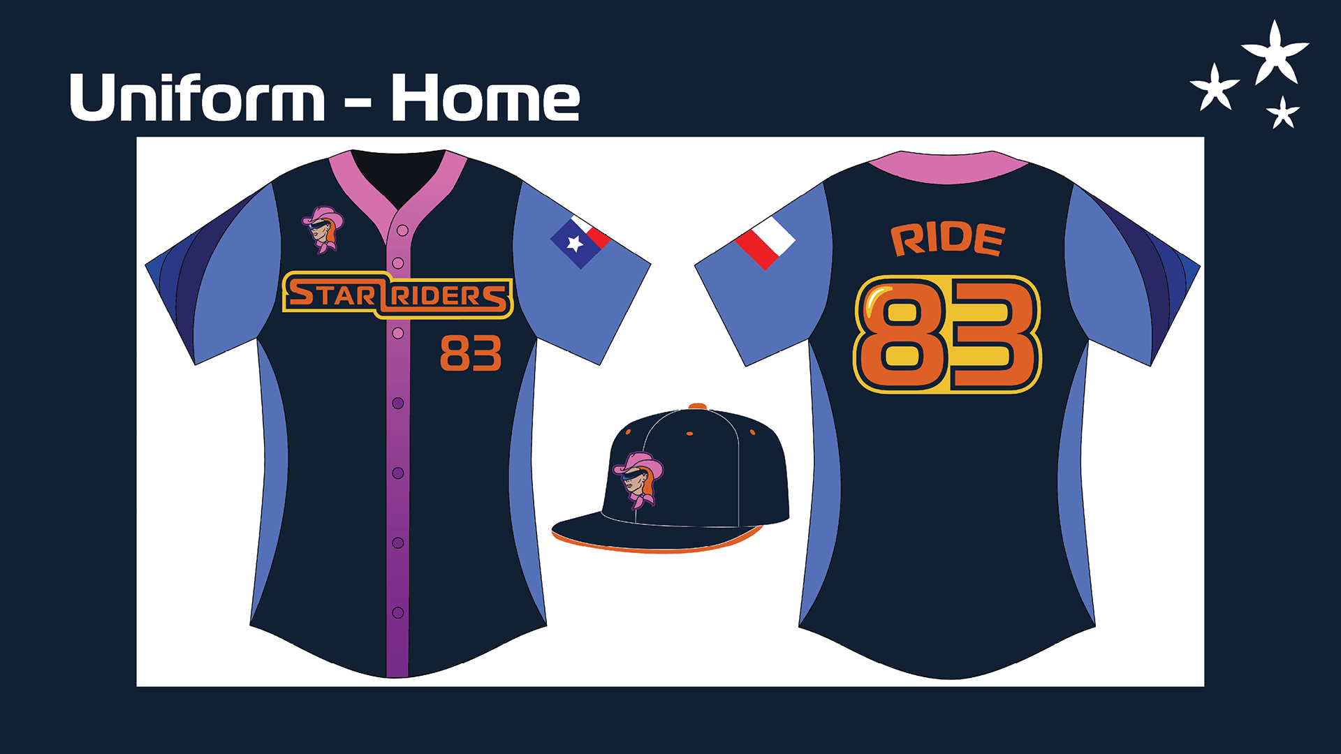
Home Jersey
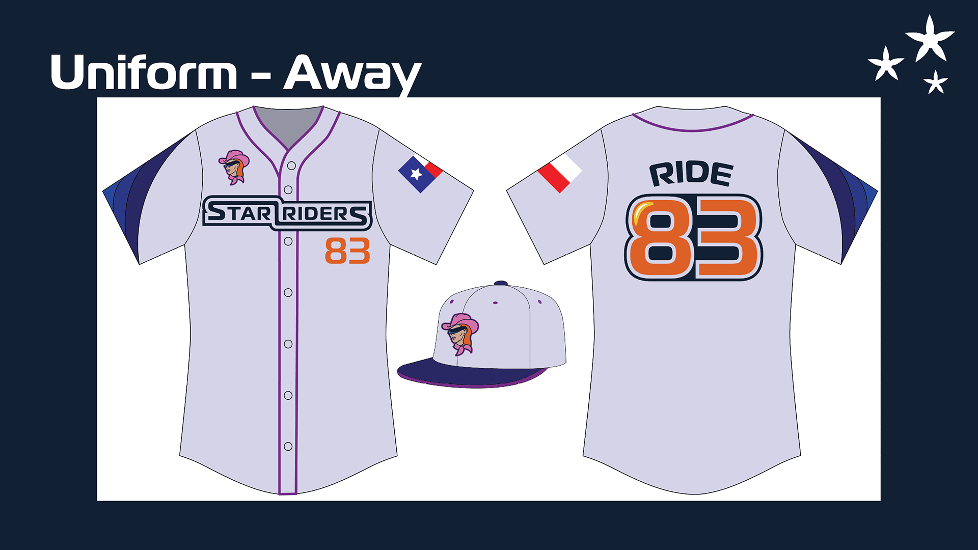
Away Jersey
Uniforms - Home & Away
The home uniforms feature the teams darkest atmosphere blue as its main color, accented with the lightest blue on the sleeves and side panels of the jersey. The team's alternate linear logo is featured across the chest. The right sleeve includes the teams signature atmosphere ring encircling the arm. Across the player's left arm is the Texas flag, positioned in a way similar to how the American flag is on NASA space suits. The team's logomark is placed over the right breast, which also references NASA space suits. On space suits like the one worn by Sally Ride, this is where the crew's mission patch would be placed.
The team's away jerseys are very similar to their home jerseys. The main difference between the two is that the away uniform is in a lighter color scheme, as is customary with baseball uniforms. Additionally, the away jerseys do not have contrasting sleeves or side panels, and the center gradient is replaced with simple purple trim.
Uniforms - Deep Space Alternate & Heritage Alternate
These uniform styles would be worn during certain promotional or otherwise special games. The Deep Space alternate jersey leans into Houston's rich culture of space exploration. The atmosphere rings are placed boldly across the torso rather than the sleeve, and the light blue contrasting panels are replaced with the team's bright orange. Stars are dusted across the top of the jersey.
The Heritage alternate jersey represents the history of women in baseball, and would be worn during games that highlight that. When women played in the All-American Girls Professional Baseball League, their uniforms were tunics instead of shirts, and they featured the team's logo in the center of the chest. The color of these uniforms were a pastel version of the team's main color. Since it was unrealistic to design this alternate uniform as a tunic, I chose to make it a pullover rather than a button up to better mimic the traditional neckline. The uniform features the team's name within a redesigned throwback logo in the style of team logos from the 1950's. Following the format of the traditional uniforms, these are completely pastel purple, which is one of the Star Rider's main colors.
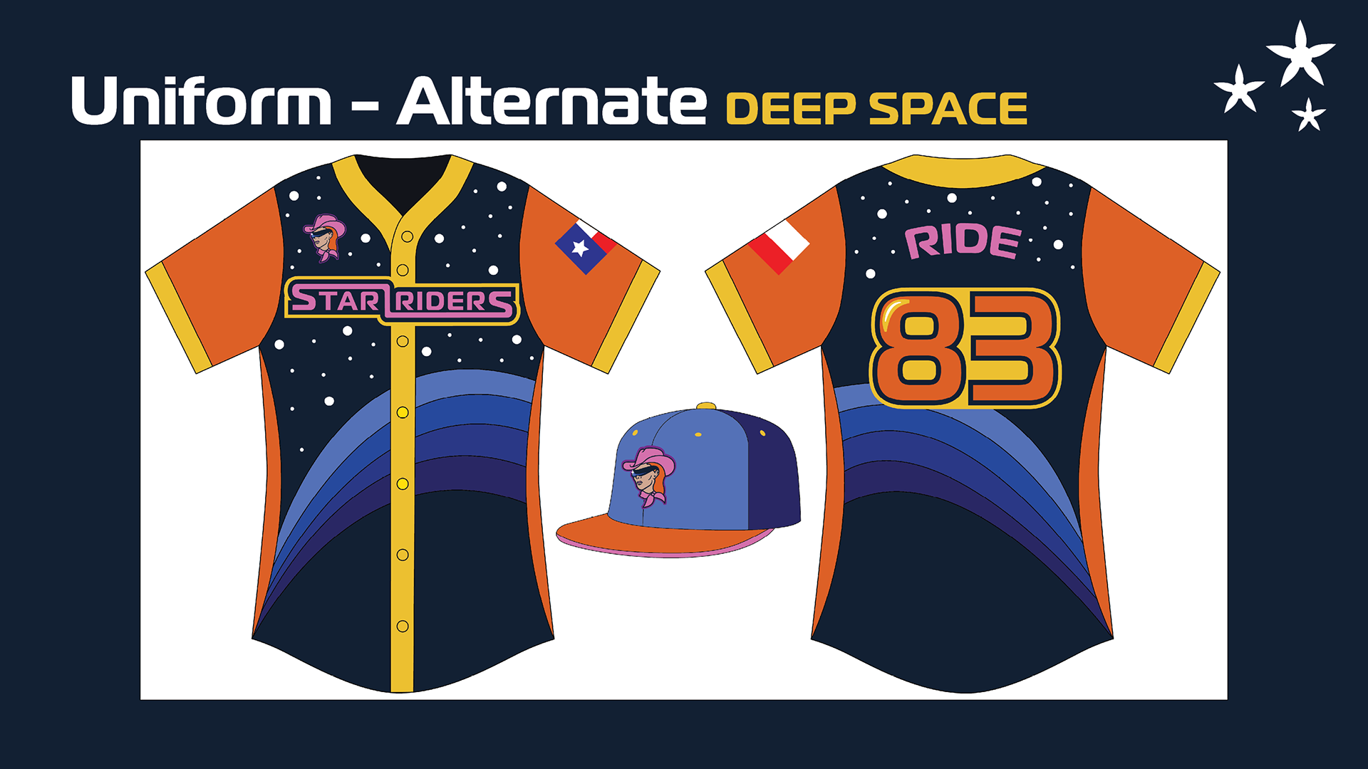
Deep Space Alternate Jersey
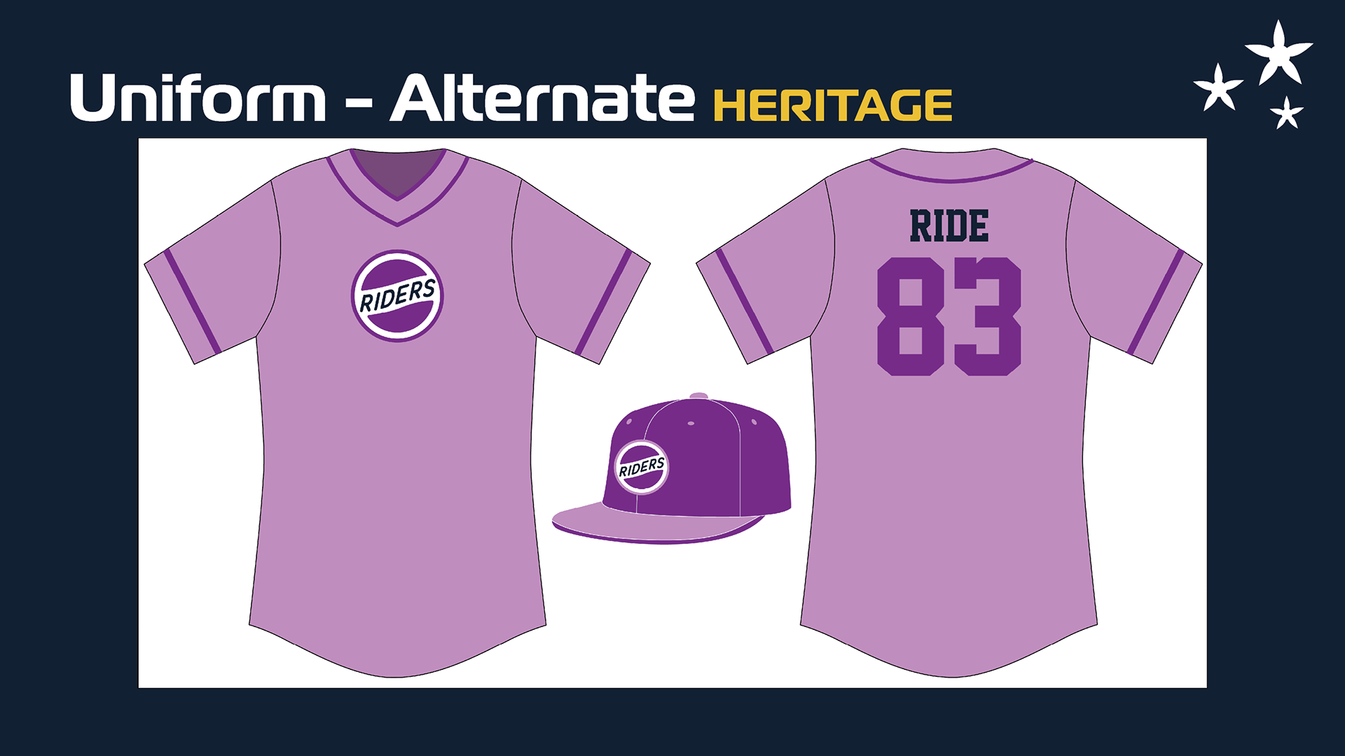
Heritage Alternate Jersey
Poster - Front
Poster - Inside
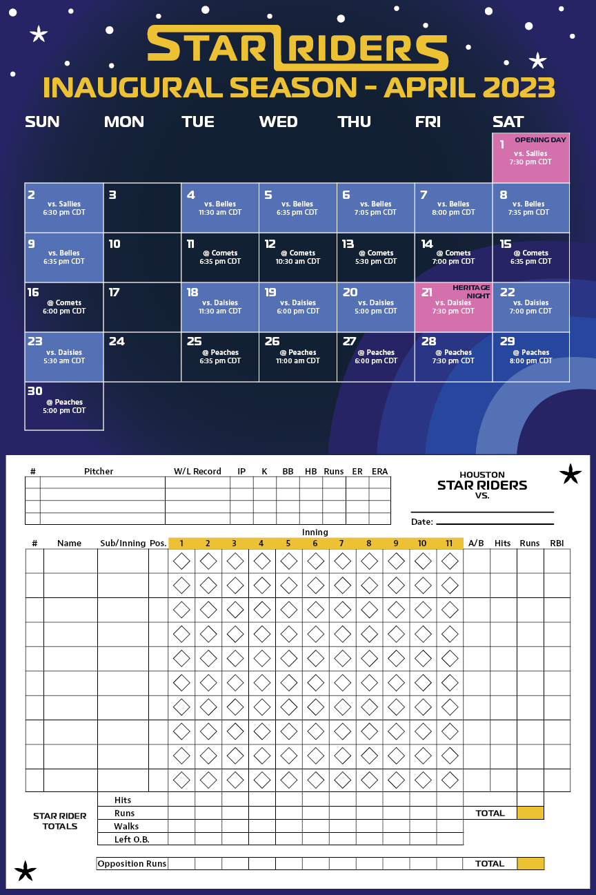
Poster with Team Schedule and Scorecard
This poster is something a fan might be given when they go to a game during the team's inaugural season. The front features a large graphic of the Star Rider's main logo and a short history about the team and women in baseball. The inside of the poster has the team's schedule and a score card for fans to keep track of statistics during the game.
This poster is designed to be folded into a brochure. If the fan wants to keep it as memorabilia, they can leave it unfolded and display the front design. However, they are also able to fold it in half to use as a schedule and scorecard only, or just for ease of use.
Brand Identity Sheet